Raise
I was approached to develop the visual identity for RAISE, a new effort by the team behind Make a Circle, this time attenuated for short-form social media documentaries about early childcare. The project centers on early childcare workers—people doing foundational, exhausting, essential labor in a system that persistently undervalues them. The goal wasn’t to make something polite or brand-safe. It was to make something that could survive being taped to a wall, reposted out of context, and argued with in public.
Early on, the exploration went wide before narrowing into our actual ICP: we wanted to focus on the people doing the work, and the theory of attention we adopted was that the social pressures moving up the attention chain are more effective that appealing to law makers directly and hoping the energy matriculates down. As a result, our brand focussed on younger (childcare workers are often between 20 - 30) more feminine coded (childcare workers are majority female) and with a winking nod to online and mobile culture.
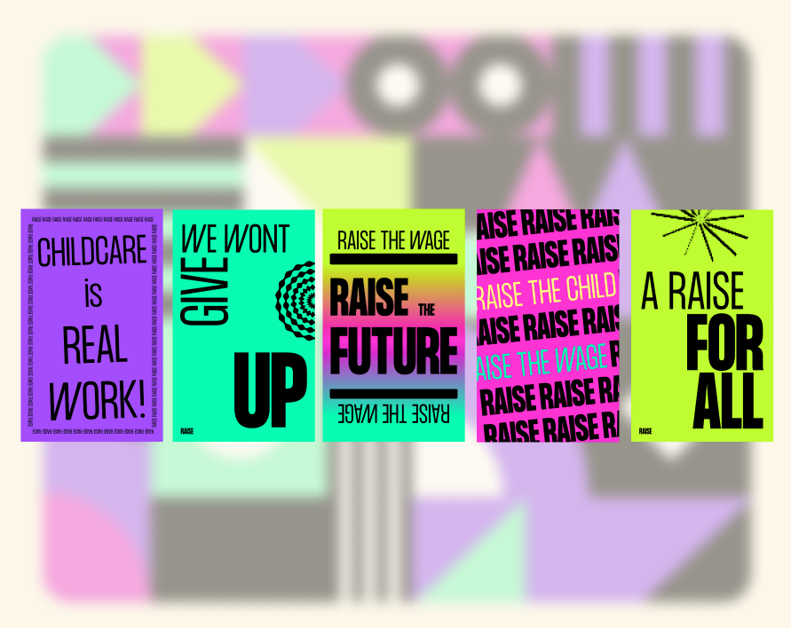
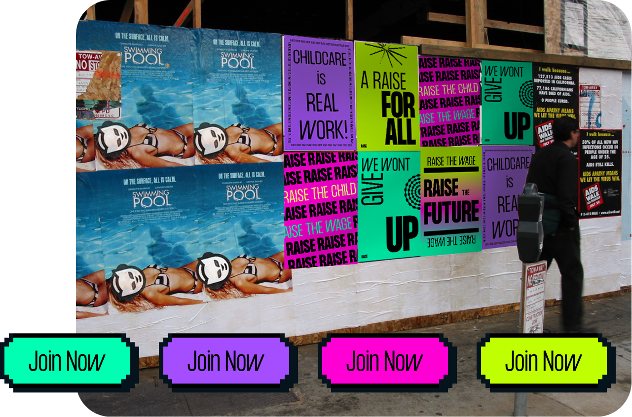
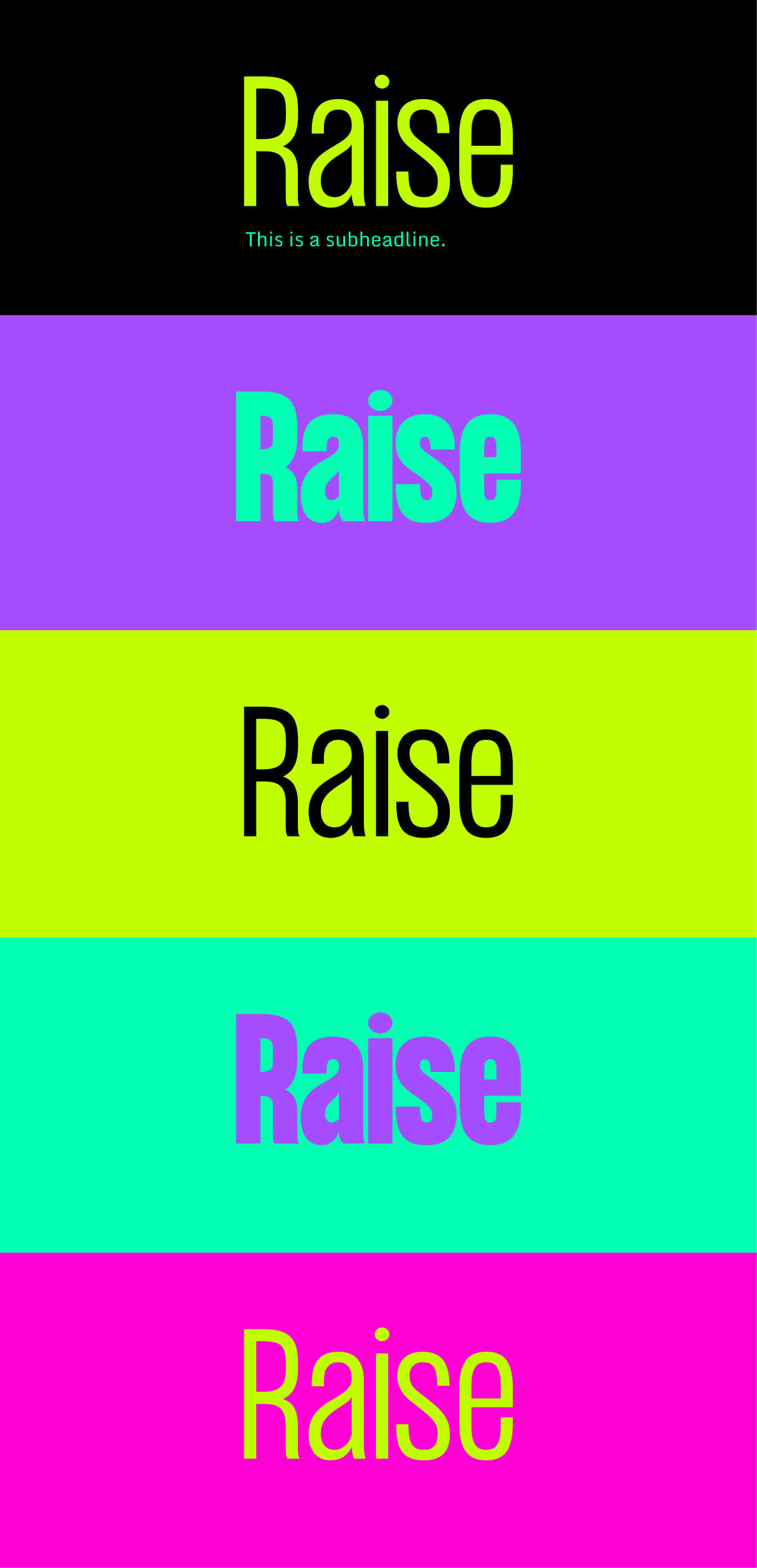
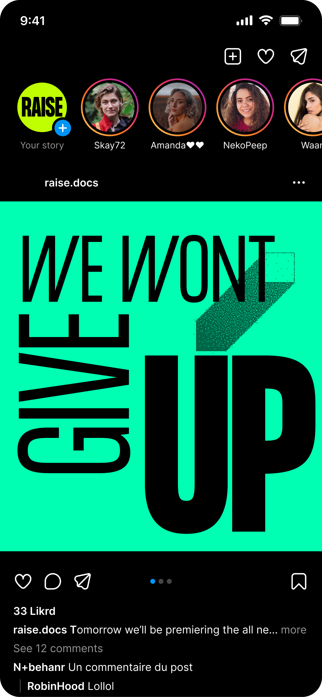
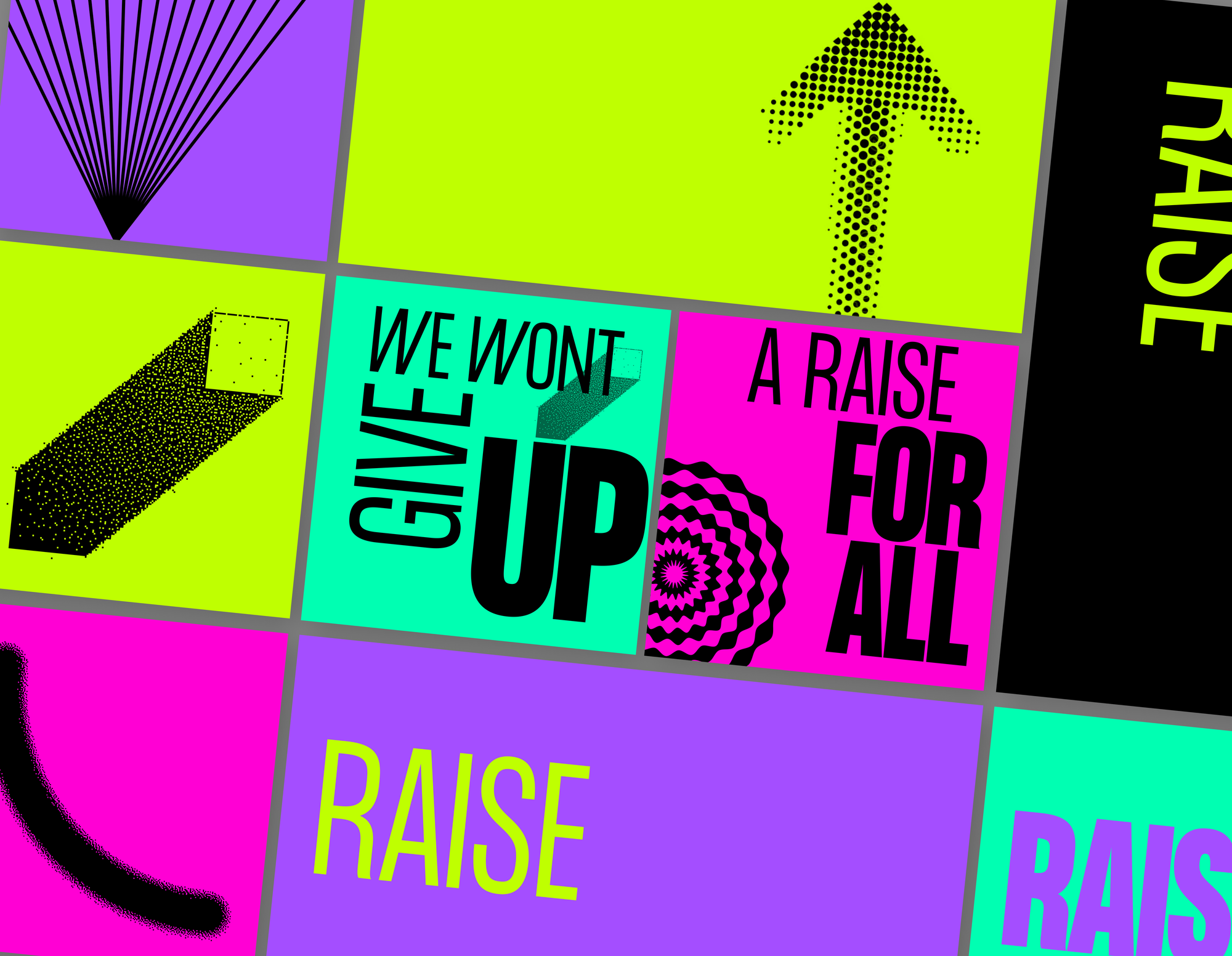
The system created leans on loud color, blunt typography, and modular graphic elements designed to scale fast and travel far. Posters had to work on phones, feeds, streets, and copy machines. Everything is meant to be read at a distance, understood immediately, and remembered later—preferably while someone is still mad.


A custom set of graphic “jibberjabbers” acts as connective tissue across formats: arrows, bursts, distortions, and directional shapes that feel half-industrial, half-improvised, kinetic and 2000s-internet-coded. Typography choices favor clarity and force over neutrality, resisting the visual blandness common to nonprofit branding.
RAISE isn’t a campaign with a tidy endpoint. It’s a flexible system meant to be used, reused, and occasionally misused by real people in real conditions.