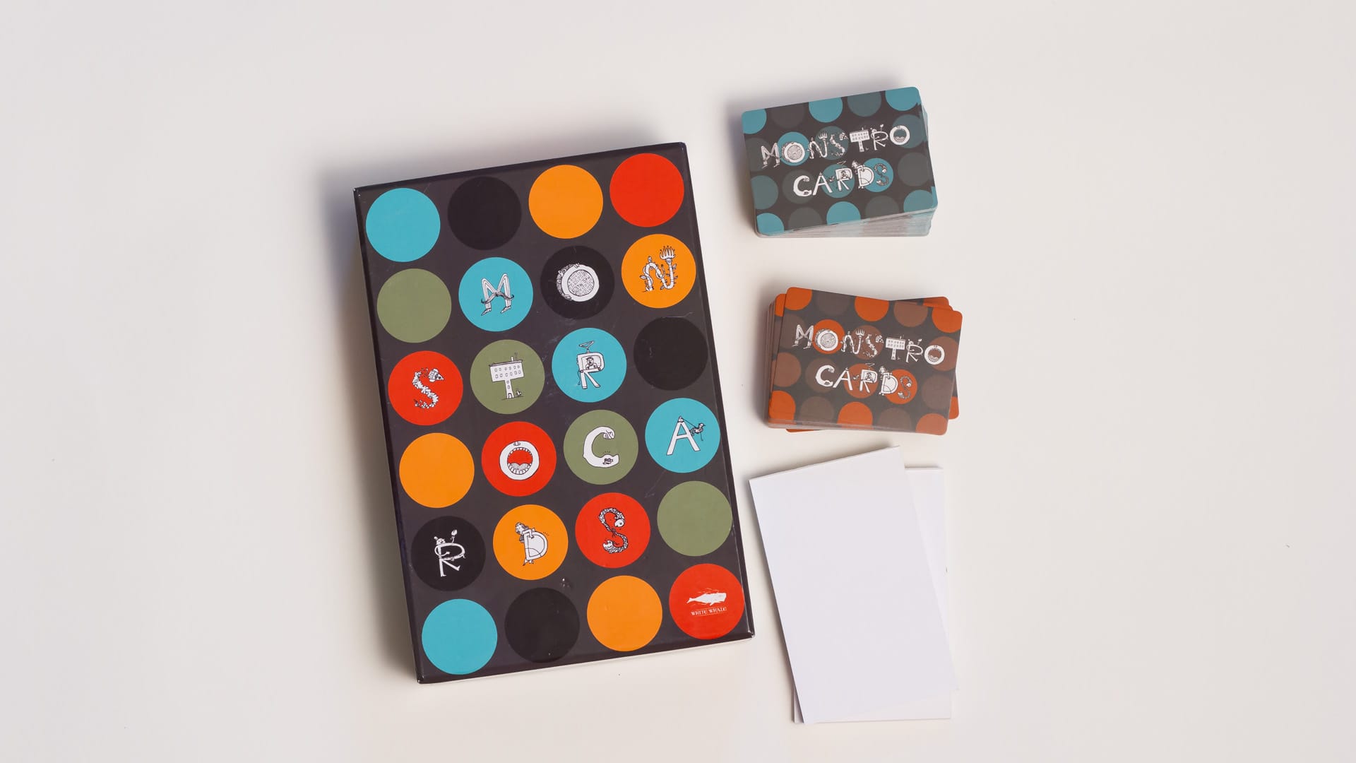
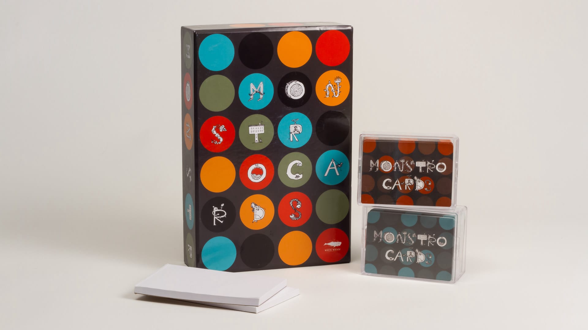
Monstrocards
Design Notes
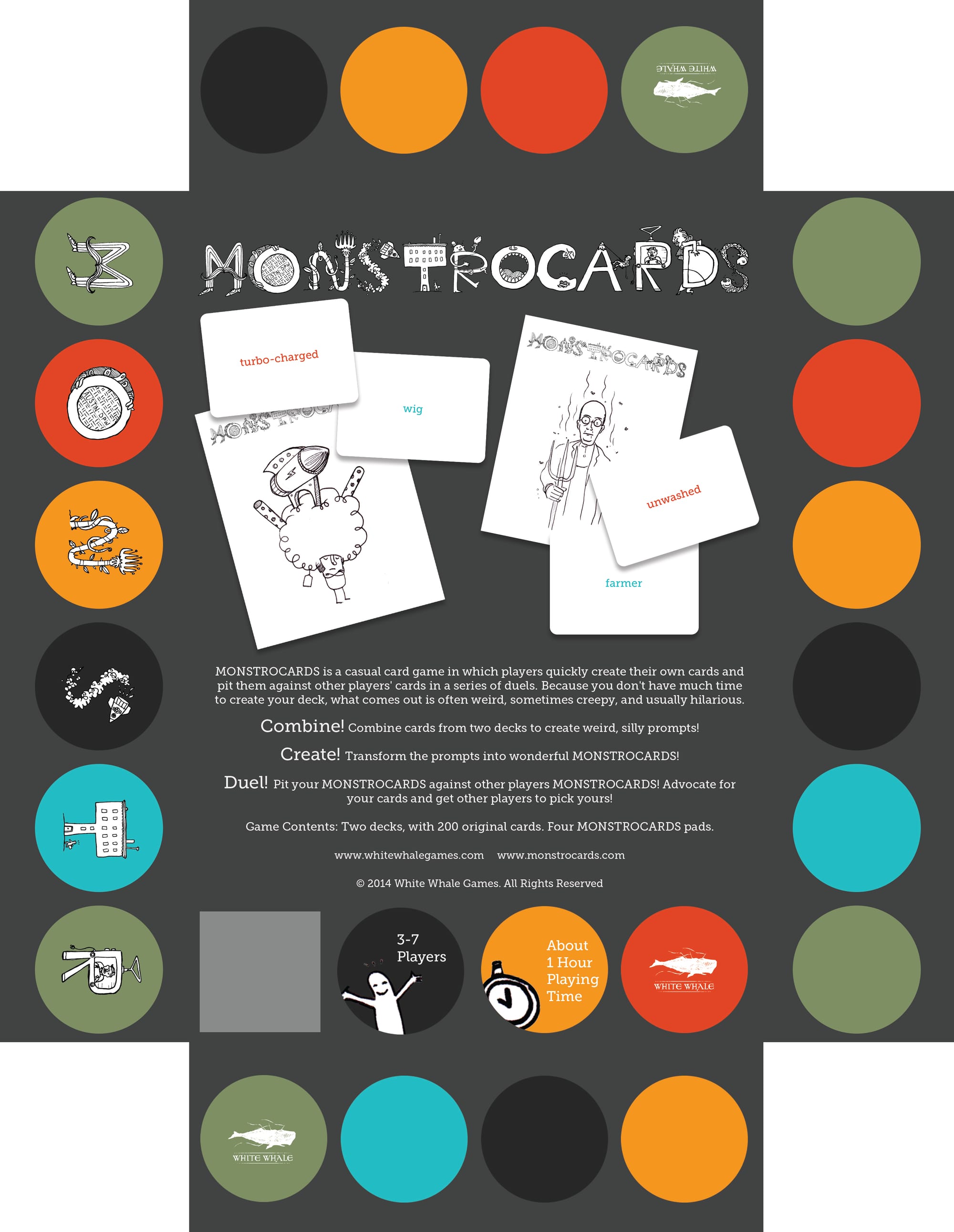
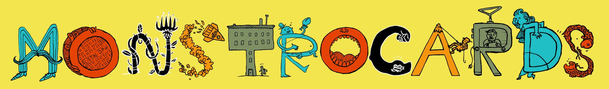
The fine folks at White Whale Games approached me out of the blue for an opportunity that I have dreamed about since I was a kid: designing the packaging for a board game. The game is pretty simple in conceit and genius in execution, a combination of Pictionary and Apples 2 Apples. As a result, the hand-drawn look was very important to the client to convey the fun and creativity of quick sketches.
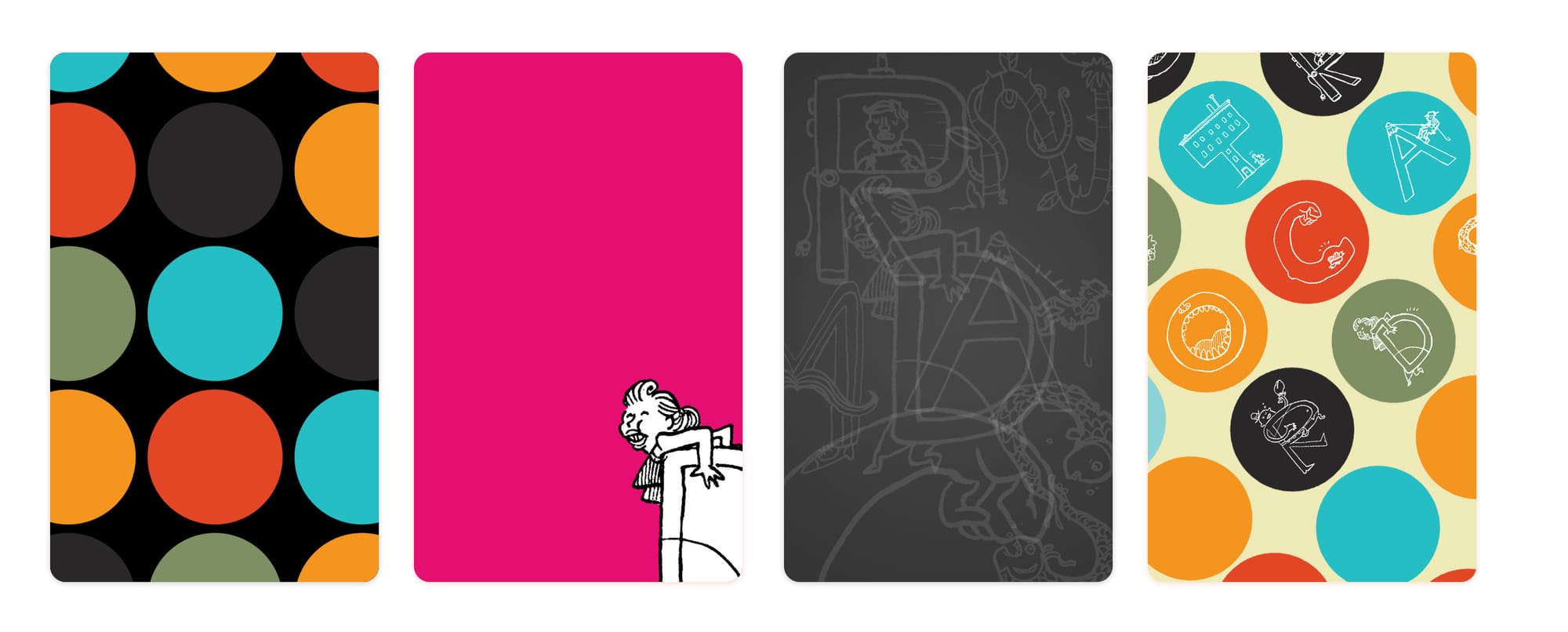
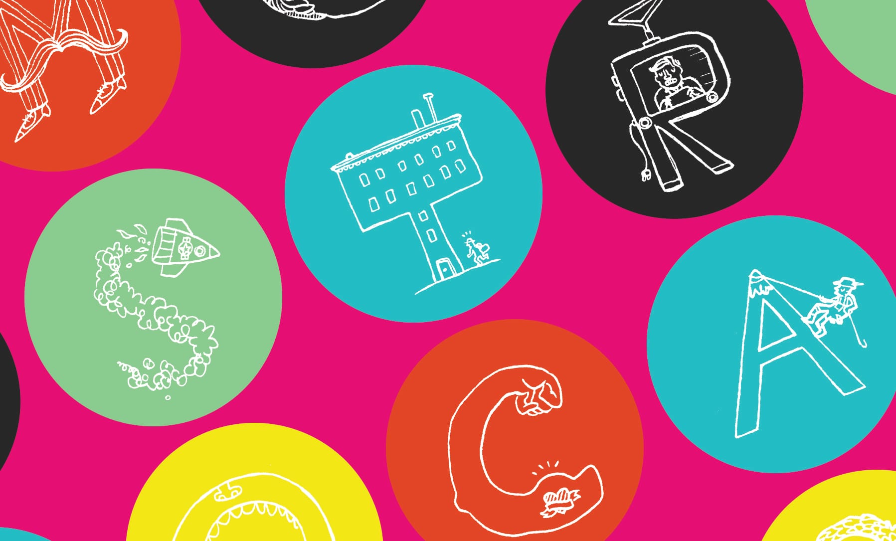
We explored many options, but we quickly found the repeating pattern to be a very compelling direction. One aspect that I hadn't previously considering in game package design was how cluttered the game market is, both before and after purchase, that is: you want the game to stand out amongst all the other games a person owns, and for it to become a household favorite. Thus, we decided to lean heavily on bright, pop-y colors and patterning, in the hope of making a distinctive presence on any game shelf.
You can view the successful Kickstarter, but unfortunately it's out of print. If you get a chance to play it, you should, it's a blast.